Google Summer of Code 2017 - Summary
Published:
Everyday, the healthcare industry creates large amounts of patient and clinical data and stores them in electronic health records. Most of this data has previously been inaccessible, in part due to patient privacy concerns, which poses a challenge to researchers working on the analysis of health records.
However, initatives like the Medical Information Mart For Intensive Care (MIMIC) database project have allowed for everyone to use and experiment with health data. In particular, the MIMIC database is a critical care database made freely available for researchers around the world to develop and evaluate intensive care unit (ICU) patient monitoring and decision support systems that will improve the efficiency, accuracy and timeliness of clinical decision-making in critical care.
This post is an exhautive summary of my project for Google Summer of Code 2017 with shogun.ml. You can find more concise details about the work (code, notebooks, PRs) here.
Table of Contents
- Table of Contents
- Objective
- Overview of MIMIC
- Features
- Visualization
- Preprocessing
- Basic model
- Results
- Improved model with temporal and lagged features
- Improvements
Objective
Using the MIMIC database, I focused on these 2 prediction tasks:
- Mortality prediction
- Hospital length of stay
More specifically, I accomplished the following:
- Extracted predictor variables from the MIMIC database
- Built machine learning models for the predictions tasks
- Evaluated and compared the performance of various algorithms
Overview of MIMIC
The MIMIC database mainly includes demographic, administrative, clinical data and much more from thousands of critical care patients. The table and the plot below provides basic descriptive statistics of the patients and an overview of the dataset.
| Information | Totals |
|---|---|
| Age, years, median data-cleaning | 65.769 |
| Gender, male (%) | 56.207 |
| Distinct number of patients | 38,597 |
| Distinct ICU stays | 53,423 |
| Hospital admissions | 49,785 |
| Hospital length of stay (days) | 11.545 |
| ICU length of stay (days) | 2.144 |
| Hospital mortality (%) | 11.545 |
| ICU mortality (%) | 8.545 |
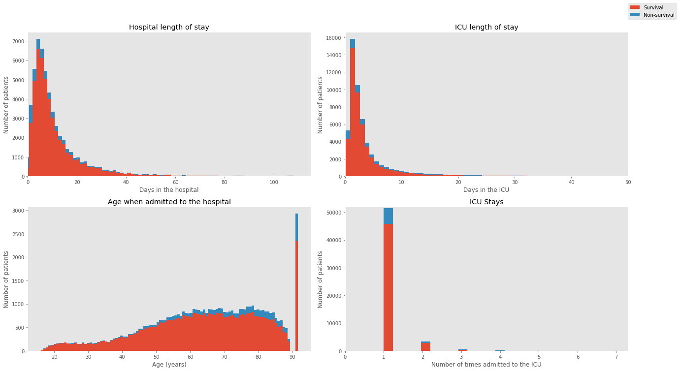
Features
Predictors from three main categories were extracted: demographic information, vital sign data and laboratory measurements. These were selected as the most relevant information in determining the likelihood of mortality and hospital length of stay.
| Demographic & Clinical Info | Description |
|---|---|
| Age | Age of the patient upon entering the ICU |
| Gender | Patient gender (male or female) |
| Hospital length of stay | Number of days spent in the hospital |
| ICU length of stay | Number of days spent in the ICU |
| First care unit | ICU type in which the patient was cared for |
| Admission type | Admission type the patient entered |
Vital signs are clinical measurements that describe the state of a patient’s body functions.
| Vital sign | Description |
|---|---|
| Heart Rate | Heartbeat rate of the patient |
| Mean Blood Pressure | Average pressure in a patient’s arteries during one cardiac cycle |
| Diastolic blood pressure | Pressure when the heart is at rest between beats |
| Systolic blood pressure | Pressure when the heart is beating |
| Respiratory Rate | Number of breaths taken per minute |
| Temperature | Temperature of a patient in degrees Celcius |
| SpO2 | Amount of oxygen in the blood |
| Glasgow Coma Scale | Scoring system used to describe the level of consciousness in a person |
| Ventilation | Whether the patient was ventilated or not |
| Urine output | How much urine was produced |
Laboratory measurements are made by acquiring a fluid from the patient’s body (e.g. blood from an arterial line or urine from a catheter) and then analyzing it in the laboratory.
| Laboratory measurements |
|---|
| Aniongap |
| Bicarbonate |
| Creatinine |
| Chloride |
| Glucose |
| Hematocrit |
| Hemoglobin |
| Platelet |
| Potassium |
| Sodium |
| Blood urea nitrogen |
| White blood cells |
Visualization
To get a better grasp of the effects of the predictors on the mortality outcomes, I explored the dataset with multiple visualizations.
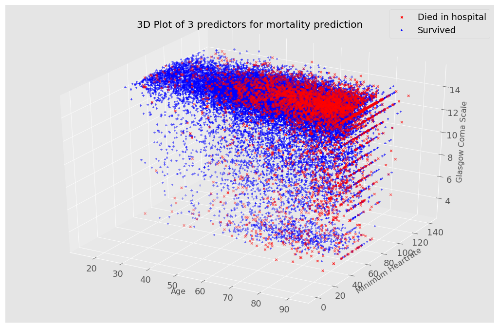
I used a 3d plot to see how different features affect a patient’s mortality probability.
In this first visualization, I included age, heart rate and the Glasgow Coma Scale which is a score indicating the level of consciousness of a person. From the plot, patients with somewhat extreme values (low heart rate and Glasgow Coma Scale values) are more likely to die, shown with a red ‘X’. Although this plot only shows 3 predictors, it is possible to change the variables on the 3 axis for visualizations.
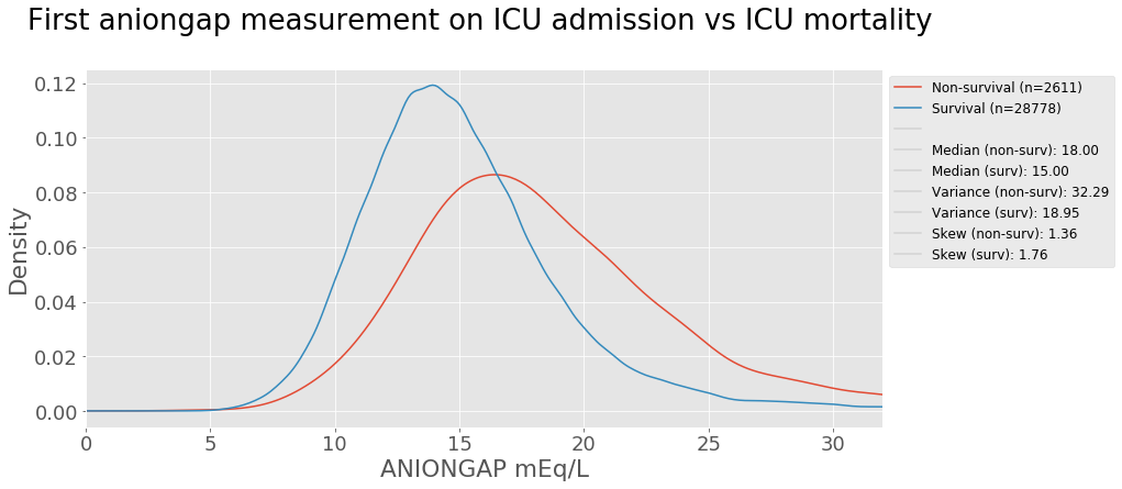
Laboratory measurements taken from a patient are also strong indictators of a patient’s health condition. Let’s take anion gap as an example. Anion gap is the difference between primary measured cations (sodium Na+ and potassium K+) and the primary measured anions (chloride Cl- and bicarbonate HCO3-) in serum (blood). The test is mostly performed in patients with altered mental status, unknown exposures, acute renal failure, and acute illnesses 1. A kernel density estimation plot is used to view the distribution of the values below shows the aniongap measurement on ICU admission comparison for survival and non-survival groups.
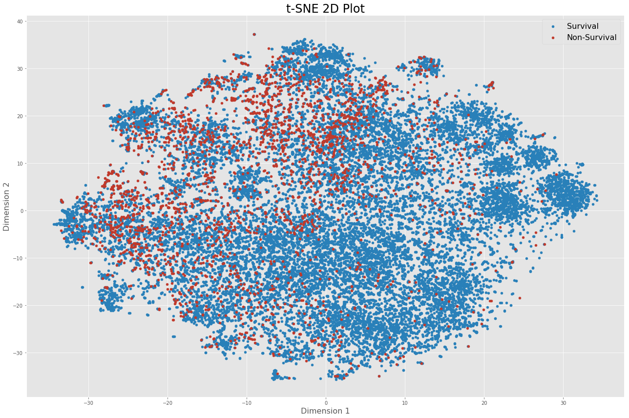
In total, 48 features are used to build the model for both prediction tasks. To visualize high-dimensional data, I employed PCA and t-SNE as dimensionality reduction techniques.

Preprocessing
Exclusions
Because MIMIC is an ICU database, the focus was placed on patients admitted to and discharged from the ICU. Patients admitted to the ICU generally suffer from severe and life-threatening illnesses and injuries which require constant, close monitoring and support. Being able to make good decisions during this time period is therefore crucial. For that reason, data points were queried and grouped based off the ICU stay rather than the individual patient to develop a model specifically for ICU patient monitoring and decision-making.
The selection criteria is described below along with a short explanation. The following points were excluded from the dataset:
- Patients aged less than 16 years old
- This also removed neonates and children, which likely have different predictors than adults
- Second admissions of patients
- Simplifies analysis which assumes independent observations
- We avoid taking into account that ICU stays are highly correlated
- Length of stay less than 2 days
- Helps remove false positives that were placed in ICU for precautionary purposes
Data cleaning
Because not all lab measurements are recorded for every patient, a lot missing values and NaNs were found in the dataset which were replaced with the mean value.
Additionally, data standardization was applied to make each feature have zero mean by subtracting the mean, and have unit-variance to ensure that all the data is normalized, that the features are in the same range.
Basic model
For mortality prediction, two machine learning classifiers were used: logistic regression and linear support vector machine. These algorithms are commonly used and allow to learn the relationship between predictor variables and a binary outcome variable.
Results
Using stratified 10-fold cross-validation, the auROC was the metric used to evaluate the performance of the classifiers for mortality prediction and recorded in the table below. The scores were also compared with sklearn’s implementation of logistic regression and linear SVM and yielded identical results. Finally, I compared the result with XGBoost, which is a popular algorithm used in Kaggle competitions.
| Classifier | Mean AUC across 10 folds (%) |
|---|---|
| Hospital mortality | |
| Logistic Regression | 84.64 |
| Linear SVM | 84.56 |
| Random guess | 50.00 |
| Logistic Regression (sklearn) | 84.64 |
| Linear SVM (sklearn) | 84.56 |
| XGBoost | 87.60 |
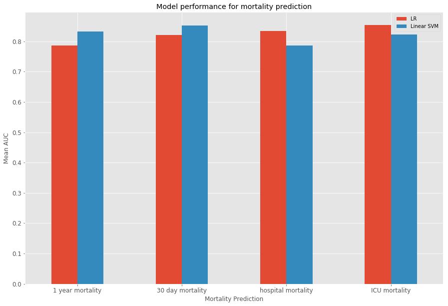
In addition to mortality prediction, 30-day, 1-year and ICU mortality prediction were evaluated. The barcharts below show the results for the different tasks.
Boxplots give an indication of the variance of the results over the 10 folds through cross-validation.

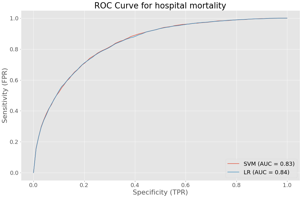
The ROC curve for hospital mortality gives an insight on the sensitivity and specificity of our logistic regression and linear SVM models. The performance of both models were quite similar.
Finally, the regression task for predicting hospital length of stay was evaluate using mean squared error.
| Classifier | Mean MSE across 10 folds |
|---|---|
| Hospital length of stay | |
| Least square regression | 110.726 |
| Linear ridge regression | 110.726 |
The training time for logistic regression and linear SVM were compared between sklearn and shogun. While shogun has a faster training time for linear SVM when compared to sklearn, the opposite scenario occurs for logistic regression.
| Classifier | Mean train time across 10 folds (seconds) | |
|---|---|---|
| shogun | sklearn | |
| Linear SVM | 4.516 | 12.05 |
| Logistic Regression | 6.265 | 0.7488 |
Improved model with temporal and lagged features
More specifically, I was interested in developing a model that could allow caregivers to monitor and predict mortality of patients. In practice, such a system would be incorporated in a real-time clinical monitoring system where it would be possible to look at a patient at any point in time and make a prediction about whether the patient will die within a certain amount of time. Using the MIMIC database which includes vital signs, medications, diagnostic code and many more variables, along with feature engineering techniques, I investigated whether I could build a robust classifier to perform such mortality prediction task.
In addition to the prediction task, I wanted to model and understand how a dying patient differs from a patient with normal behavior moments before days, hours and right before death.
In this improved model, I exploit the temporal information, taking into account the fluctuations of the vital signs over time and most importantly does not look at how the vital signs change moments before death.
The vital signs were downsampled to every hour, for the first 24 hours. Afterwards, lagged features from the last 3 observations (t-1, t-2, t-3), which are the vital signs at the previous hours, were computed by shifting columns of the time stamp. A rolling window is then computes the mean, min, max and median over the entire vital signs time series of a patient in the last 6 hours. Below is a sample of data points with only heart rate used. The list of vital signs used as features can be seen in the table below.
| Vital sign | Description |
|---|---|
| Heart Rate | Heartbeat rate of the patient |
| Mean Blood Pressure | Average pressure in a patient’s arteries during one cardiac cycle |
| Diastolic blood pressure | Pressure when the heart is at rest between beats |
| Systolic blood pressure | Pressure when the heart is beating |
| Respiratory Rate | Number of breaths taken per minute |
| Temperature | Temperature of a patient in degrees Celcius |
| SpO2 | Amount of oxygen in the blood |
To observe how these features differ between dying and surviving patients, a stacked histogram was plotted to view the distribution of these vital signs values across both groups.

In the end, the features included vital signs, their lagged observations and window computations, demographic information and the hospital length of stay of the patient. Three classifiers (logistic regression, linear SVM and random forest) were evaluated and compared. The feature matrix was constructed where a single row represented a patient observation at a certain point in time with the features mentionned above. Because the entire dataset consists of over 500,000, the training and testing set were sampled and evaluated several times. The subset of the data consisted of 100,000 points. The results were recorded in the following table.
| Classifier | Test set AUC score (%) | |
|---|---|---|
| 1-day Hospital mortality | 7-day Hospital mortality | |
| Logistic Regression | 73.48 | 71.71 |
| Linear SVM | 73.22 | 71.54 |
| Random Forest | 79.35 | 79.64 |
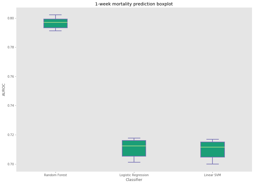
Random forest produced the best results among all three classifiers for 1-day and 1-week mortality prediction. The variance across the 10 runs with 100,000 samples from the entire dataset can also be seen here.

Improvements
Because of the size and complexity of the MIMIC database, there are many problems that can tackled. Here are some challenging areas that were beyond the scope of this data project, but that would have been interesting to include.
- Patient similarity
- Survival analysis (time-to-event prediction)
- Disease prediction
Leave a Comment